DragonRising Publishing
 Interesting stuff
|

A new website, needs a new logo - and unlike so many other people, I'm not afraid of the obvious.
There are times and places where the obvious is exactly what the witch doctor ordered, so there can be communication, understanding, information transmission.
In this case, we had a website called I SAW HAT DOT COM. And the logo is an eye - a big eye, at that.
|
|
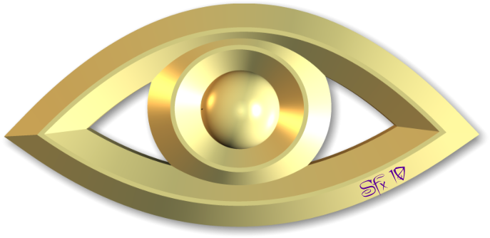
Here's the original design, Golden Eye.

Golden Eye by Silvia Hartmann
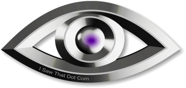
And here is the logo for i-saw-that.com

Metal Eye Logo Design for i-saw-that.com
Is it obvious?
Yes.
Is it memorable?
Yes.
Does it work for the site/brand?
Yes.
Ah ... then it could just be a good design ...
And the moral of the tail?
Big Brother, WE are watching YOU.
SFX March 2010
|
|
|
|